We are a group of creative people who help organizations make their ideas beautiful.
The Ugly Truth: EXPOSED!
The Scourge of Overhead Lighting
Look up. I bet it’s up there, looming over you, wreaking havoc on your body and mind without you even being aware. That’s the way it wants it. It laughs at you while it covertly ruins your life. Maybe one of the reasons we’re all so angry, stressed and worn out right now is that we spend the majority of our waking lives inside spaces that literally make everything look uglier. It has become clear to me that we have valued efficiency (read: cheapness) over comfort and beauty for too long. Pair that with our insatiable need to infuse “productivity” with virtue, and you’re left with a bazillion little cubes dotting the landscape, their interiors flooded with bright lights and sad, sad people.
Why do we do this to ourselves? Are we so full of self-hatred, that we have actually grown to love our harsh, migraine-inducing light overlords? Or are we just too blind (from the LIGHT) to see we don’t need to live this way? It’s time we put overhead lights in their place: THE TRASH.
Cue the Lights
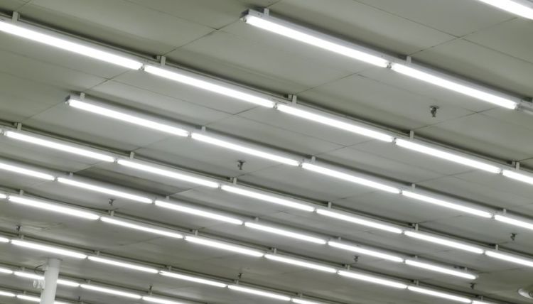
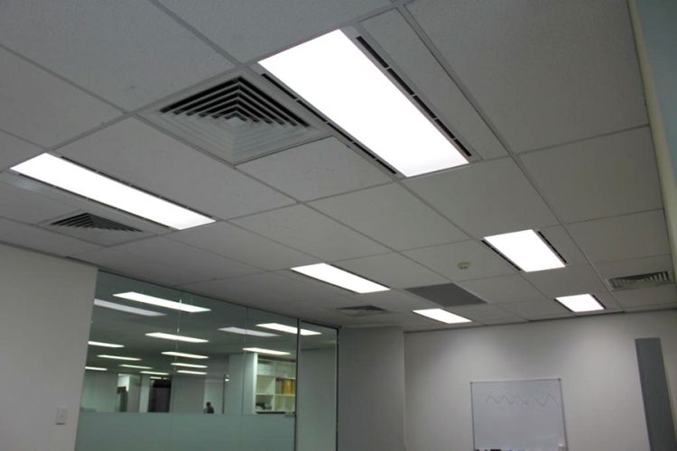
Outside a rented banquet hall somewhere in southern Illinois, the OG overhead light –the Sun– shines on a brick facade, warming the spacious asphalt parking lot. Inside, one cannot discern day from night. Around 80 women in an alarming amount of floral prints gather in this room-without-time for a bridal shower. There are windows, but they’re small and toward the ceiling. None of the warm sunlight reaches the room, nor does it reach any of the Kate Spade-themed centerpieces. The grey floor and grey walls reflect a buzzing white glowscape, as rectangles light up the drop ceiling like an upside down Billie Jean video.
A glaring atrocity was taking place at this bridal shower, and it wasn’t the centerpieces. So commonplace is this crime, that no one even batted a heavily-mascara-ed, but surely-fatigued eye.
Did this room spring forth from an algorithm incapable of understanding nuances of the human condition? Was it built on a reality show where the architects had 2 hours to create a space using only materials they could steal from a hospital lobby? No, this was agreed to, built, and paid for. On purpose!
“You see -here- *points up, proudly* we’re going to do a drop ceiling, with tiny windows, and no architectural points of interest. And then - THEN - oh man, this is gonna blow your mind! We’re going to light it up with some buzzing blue-ish lights that will make you look as close to death as possible. Please sign here to pay us your money.”
How We See
The whole point of lighting design for any structure is, of course, for people to see stuff. What and how they see said stuff is the design challenge. Good architectural lighting design (which includes both artificial and natural light) should enhance the experience of people within the space.
LIGHTING DESIGN CONSIDERATIONS:
1. Function the light serves (what actual stuff needs to be seen)
2. Aesthetic appeal (how the light itself looks in the space)
3. Energy efficiency ($$$)
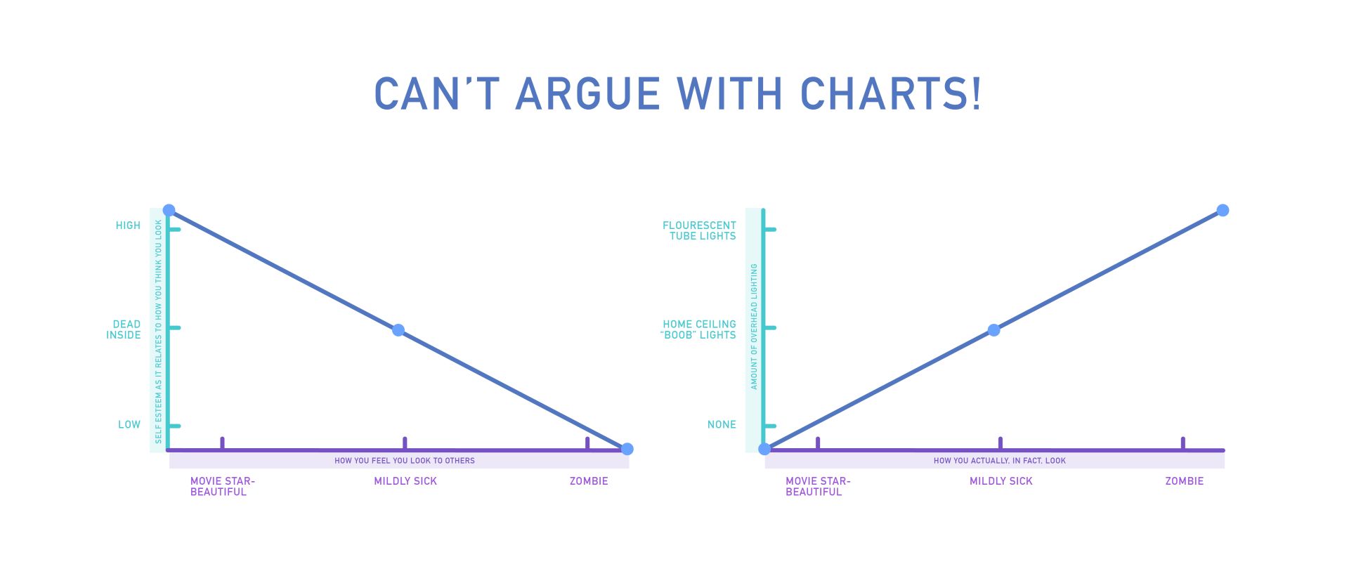
Ignoring any of the three considerations is simply a failure of design. That’s a hot-light-take, but I stand by it. As you can see in the chart below, which I’ve created to make you agree with me, ignoring any of these considerations is detrimental to the quality of the design.

Is it Bright in Here?
The biggest benefit to using overhead fluorescent and LED lighting for large areas is energy efficiency. They allow for high-intensity light coverage at a lower cost, since they consume less electricity than incandescent bulbs. But this operates under the assumption that the amount of illumination these lights provide is the appropriate amount. It’s worth asking if this level of brightness is actually serving the intended function.
If only the amount of light actually needed was used, it may not be more cost-efficient to flood every crevice of a room with white-blue light, as though a spaceship might land at any moment.
And if we really want to save on energy - how about we all turn some lights off once in awhile?
(Hu)Man In the Mirror
Have you ever taken a look at yourself before leaving for work, and thought, “Damnnnnn, I look good!”, only to catch a glimpse in the office bathroom mirror to find you’ve transformed into a ghoulish, shiny, blotch-covered simulacrum?
Achieving the look of the undead via high-intensity fluorescent or LED overhead light is partially accomplished through the position of the light, and partially the light itself. Think of the most flattering lighting possible for a person, portraiture lighting:

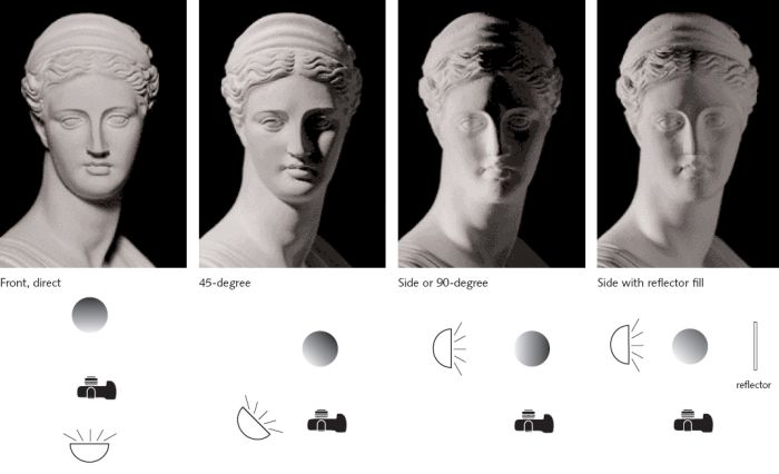
I’m obviously not suggesting everyone be professionally lit at all times*, but to illustrate that a good portrait photographer would never photograph their subject with the only light source coming from directly above. It’s hideous.
1. If we accept this as fact:
Overhead lighting is the least flattering angle for people.
2. Then we must be, in our choice of using light positioned overhead, saying:
The way people experience looking at each other is unimportant, and the way people feel about the way they look is unimportant.
I don’t think anyone really believes that. We value our appearance and present ourselves, especially at work, in what we hope to be a flattering manner. And when other people look their best, we enjoy looking at them. I’m not creepy, you’re creepy!
*I take it back, I am suggesting that.
True Colors
No one, and no thing looks as good in aseptic, artificial lighting as they do in a more natural light, and there’s an actual, science-y reason for this.
The color rendering index (CRI), refers to the ability of a light source to faithfully reveal the colors of an object in comparison to a natural light source. For example, blueish LED and fluorescent lights have a very low CRI. It’s factually the least flattering for your face, and really, for all things on the earth. It’s literally not representing things visually as they are, but as an artificially created version.
Do you see what I’m saying here!? You’re spending your life visually consuming a world made duller, less vibrant, less beautiful than it is. Imagine what that does to the human psyche! We, beasts meant to traverse the natural world, looking up at starry skies; watching the play of sunlight as it catches the majestic mane of a hungry lion--- oops I killed us all in that analogy.
To further illustrate the assault on our vision, as well as on the self-confidence and likeability of our peers, I’ve taken the liberty to show you how different Matt Kubiak looks with low CRI lights overhead and in natural sunlight shining in the window. Just a more likeable guy on the right, wouldn't you agree?
Mood Lighting
Lighting affects our emotional experience of a space, too. It creates ambiance, a word which you must say in a British accent. Highly illuminated areas with lights flooding in from above tend to create a gloomy, depressing atmosphere. Think of a DMV or a 24-hour diner, where the lighting is informed only by utility and not emotional appeal. They’re glaring and sterile. They’re sad. Now think of a nice restaurant, museum, or an old cathedral, where the lighting experience has been carefully considered to provide warmth, comfort, and even inspiration.
Our lighting choices should depend on what sort of mood is appropriate for the space, of course. At home, we do a lot of relaxing, or at least aspire to. Ideally, we’d like our homes to feel as welcoming and comforting as possible. Yet, so many homes are inflicted with the disease of ceiling “boob lights” illuminating shiny foreheads and bald spots, as though there’s no other option to light a room other than “extremely” and “from above”.

Side Boob: Cheap, ugly and inhumane, these ubiquitous fixtures of home lighting are a huge turn-off.
Conversely, in public spaces or offices, that sleepy-comfy feeling may not be the ideal. In these cases, maybe the ideal mood is: productive, alert… frantic… stressed… filled with crippling anxiety… unable to wind down and go to sleep after work because Circadian rhythms are out of whack due to melatonin suppression caused by a lack of darkness, which eventually leads to the seeking out of alternative-medicine placebos to help with mysterious undiagnosed fatigue, then spending thousands of dollars on treatments that will never actually help, because the real culprit here is abusive bright overhead lighting. I mean, that’s a mood, I guess.
Step Into the Light
The solutions to this problem are right in front of us, in a diffused, soft, pinkish tone.
In terms of lighting, all spaces –especially those we spend most of our waking lives in– deserve to be well-designed. Utility and the status quo shouldn’t be the primary considerations here, as no lowered utility bill is worth the price of human dignity.
And look, what’s done is done. We can’t change the past. We can’t change decades of distorted, pallid faces enduring the pain of looking at one another for the past 70 years. We can’t take away the internalized existential ennui wrought by spending a life encased in an artificially brightened sarcophagi. But what we can do, is move forward.
No lowered utility bill is worth the price of human dignity.
The next time you need to rethink your office space or remodel a room, don’t just throw up another fluorescent tube. Don’t buy a slightly updated version of a boob light. Try some lamps. Install a dimmer switch. Maybe a chandelier. Better yet, roll up those mini blinds and let the sun in. You’ll feel better. And just as importantly, you’ll look better.
